Project 3 - Visualizing Avatar: The Last Airbender for CS 5124
Introduction
As fans of the show Avatar: The Last Airbender, my team decided to delve deeper into the realm of the Fire Nation's reign. Users can view information about which bender type talks the most in the show, what the main characters were saying, who talked to who, and the number of episodes the characters appeared in, in one simple visualization. We used plenty of imagery from the show to make it even easier for fans to navigate.
The Data
Our team sourced the data using this page compiling all the scripts on the Avatar Fandom wiki, creating a custom script to parse all the data.
Our scraper file can be viewed here - to summarize, the scraper was written in Python to scrape each transcript on the page previously mentioned. Each page features an html table of the whole script, with the character and what they said, along with extraneous information such as stage instructions. An http request was made to each page to grab the contents of the page body. Each episode transcript was saved into a Pandas Dataframe with season, episode, character, and dialog, added in the order of the transcript.
The data was saved to a csv file containing every dataframe row, viewable here.
Visualization Components
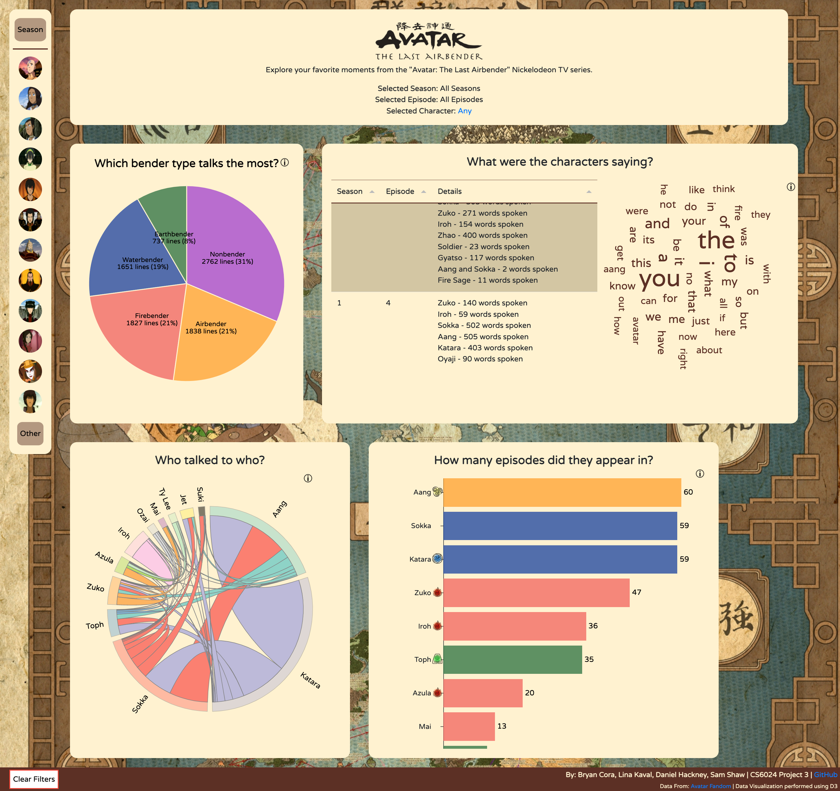
Full Dashboard View
Design Sketches/Justifications
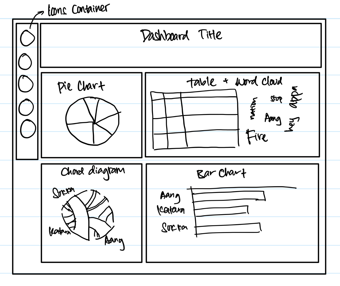
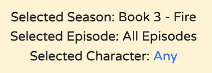
One of the main design decisions we made has to do with the character select bar on the left side of the screen. When we were considering different ways to filter by character, we didn't want to do a simple dropdown button. We took inspiration from the Discord server bar to come up with our simple yet intuitive design.
The filtering shows at the top of the screen, and can be reset using the button at the bottom of the screen. We are able to filter by season/episode and character.
1. Show-Specific Visualization - Pie Chart of Which Bender Type Talks The Most?
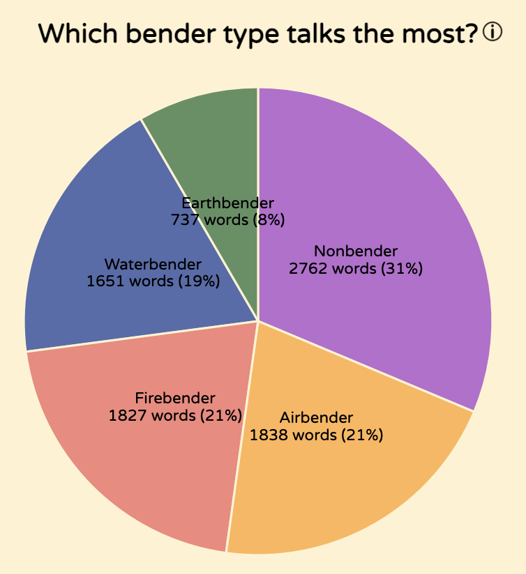
This visualization helps the user understand what bender type speaks the most in the show. Users can see how many words were said by each bender type and the percentage of the whole cast.
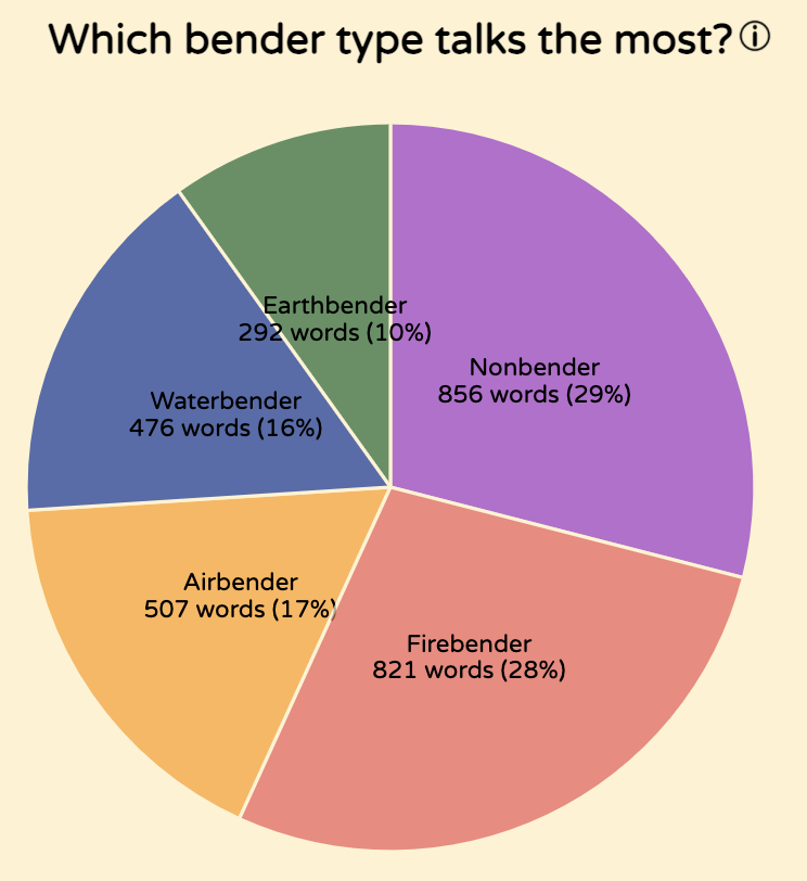
Clicking through the filtering options on the left-hand side allows the user to see the bender distribution for any season or episode.
Design Sketches/Justifications
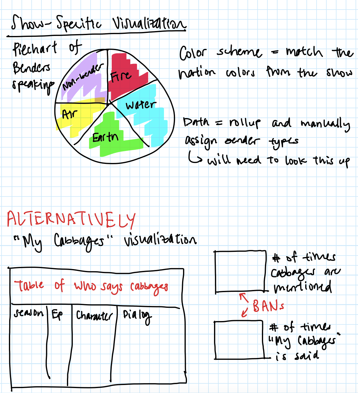
We wanted to focus on the unique aspects of our show - benders are an easy to understand yet unique part of the show. We thought we could make a simple visualization with the benders and how often they speak.
With our bender's piechart, we decided on keeping the color scheme of the actual show - red for firebenders, yellow for airbenders, etc. We kept this color scheme consistent across our visualization.
Specifically earth - #063, water - #039, fire - #e55, air - #FF9900, nonbender - #9932cc
Another option we came up with for our show-specific visualization is to focus on the cabbage man, an iconic character whose cabbages are always destroyed.
I created a mockup of what that viz would look like - mentions of cabbages in each episode graphed in a table, and BANs to show the user how many times cabbages are mentioned and specifically the phrase "My Cabbages!" is mentioned.
However, this would have disrupted the theme of our visualization and we decided that having the bender's piechart was more useful both to fans and non-fans, as well as easier to accomplish in our limited time.
2. Table + Word Cloud - Analyzing what the characters say
This visualization helps the user explore what the characters are talking about in the show.
We combined a table and the word cloud into the same section because of how they both pertain to exact phrases from the show.
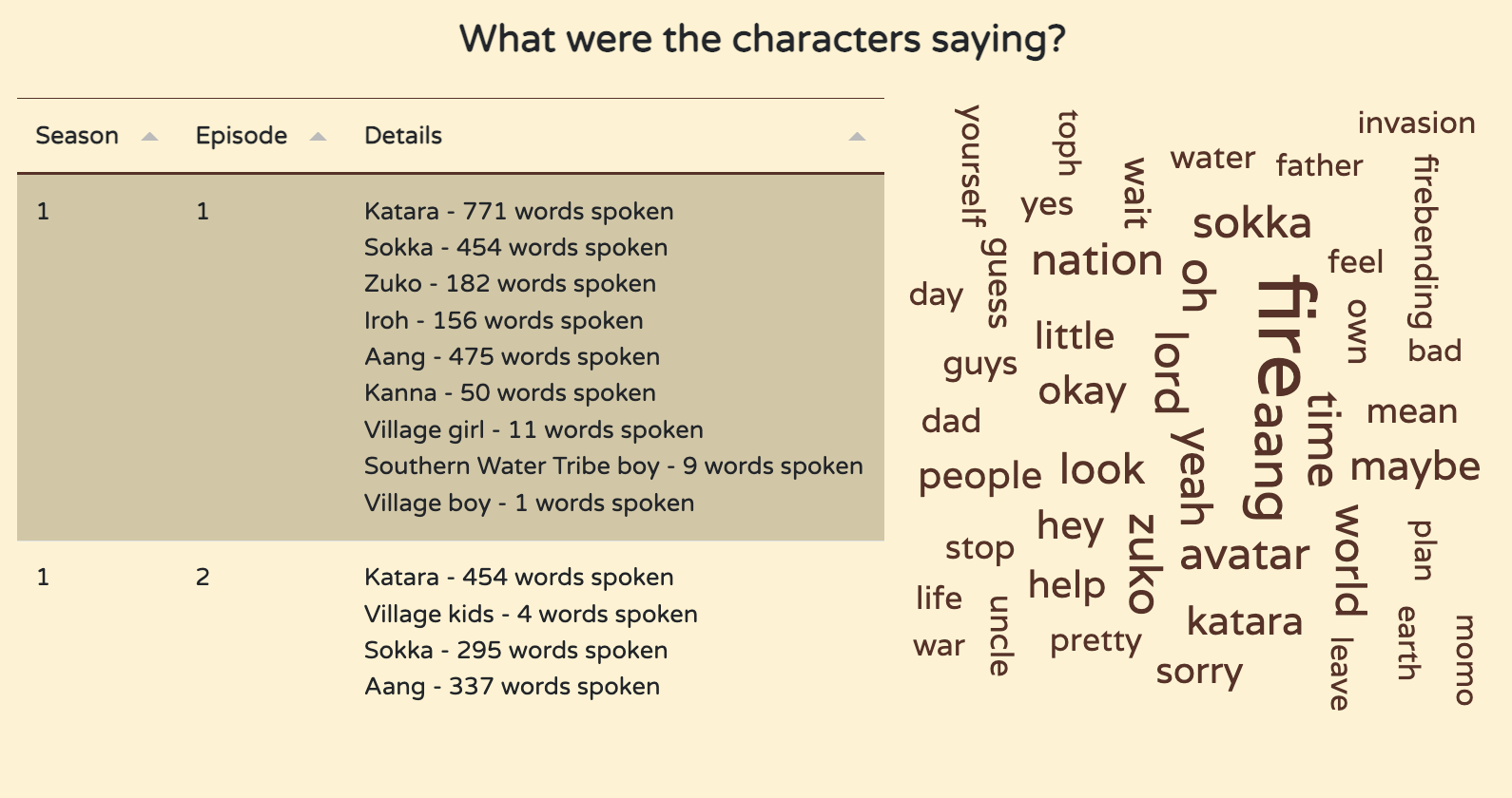
2A. Table - Analyzing what the characters say
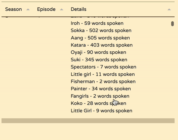
The default view of the table allows the user to view each episode from each season and understand who was talking and how many words they spoke. Users can scroll down the table to view all the information.
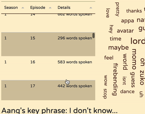
When a character is selected, the table updates to show only the episodes in which they appeared. The reason why we placed this next to the word cloud is because the word cloud will also update - this will be covered later.
If one of the main characters is selected, a blurb also shows of their most said phrases - this was manually found using this word text analysis website, allowing us to find key phrases after pasting in all of the character's lines.
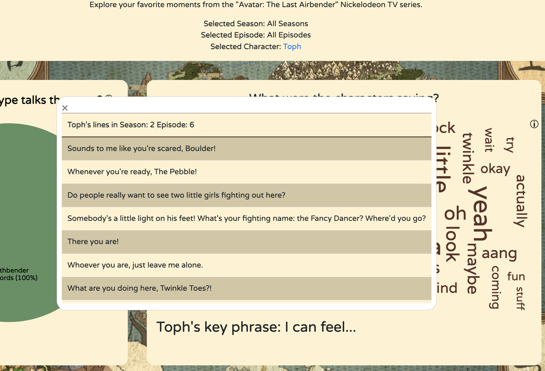
Additionally, once a character is selected, clicking on the row allows the user to see all of the character's lines from that episode. A popup appears with another table containing all of the lines from the episode.
Design Sketches/Justifications
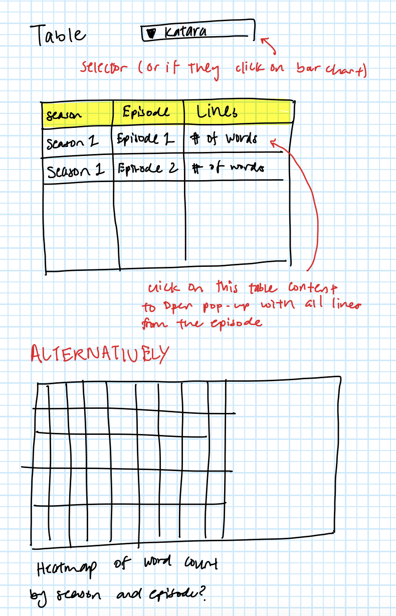
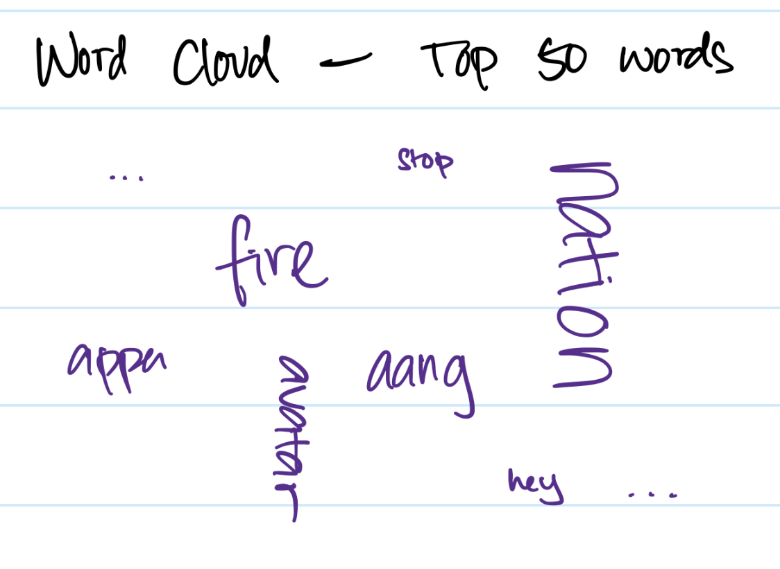
The mockup was created while thinking about the requirements of what we had to show. The word cloud would show the words spoken by character but we still needed a way to be able to view the character's lines by season and episode.
The popup is the only way users can get the full lines spoken by the characters, so including it added another dimension of data to our visualization.
2B. Word Cloud - Analyzing what the characters say
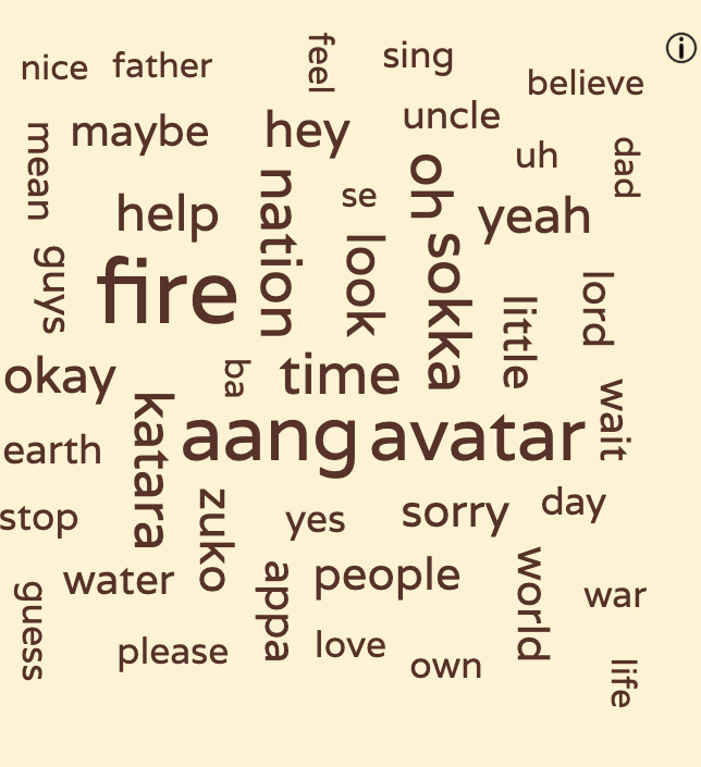
The default view of the word cloud features all the words ever said in the whole series. Clicking on a season (and optionally followed by an episode selection), filters out the words to just that season/episode.
Stop words and other fillers were removed according to this list.
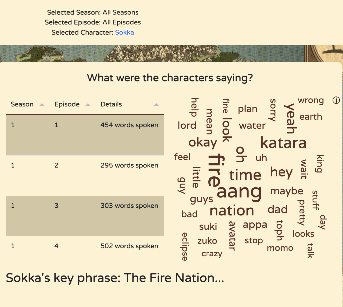
Additionally, choosing a character will filter the word clouds to only words spoken by that character. Pictured: filtering based on Sokka
Design Sketches/Justifications
We decided to make the color of the text brown to fit with the theme of the show. Most things on the page are yellow and brown, but yellow text is hard to read.
3. Chord Diagram - Who Talked To Who?
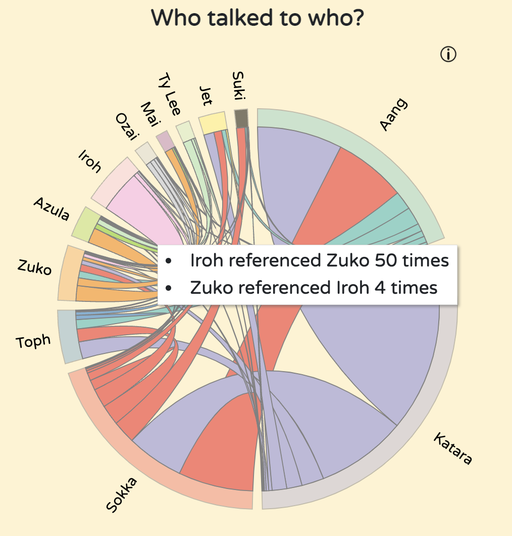
The chord diagram is static regardless of the filters applied. This is not something we intended, but we were unable to get the chords properly re-rendering when filters were applied. Essentially, it shows how often each of the main characters refers to another main character by name. Hovering over each arc shows a tooltip showing exactly what the number of references comes out to be between those two main characters.
Viewers will notice very strong connections between Aang, Katara, and Sokka, as well as between Zuko and Iroh (who travel together throughout nearly all of the series). We included this visualization because we believe it highlights the strength of relationships or bonds between characters effectively.
Design Sketches/Justifications
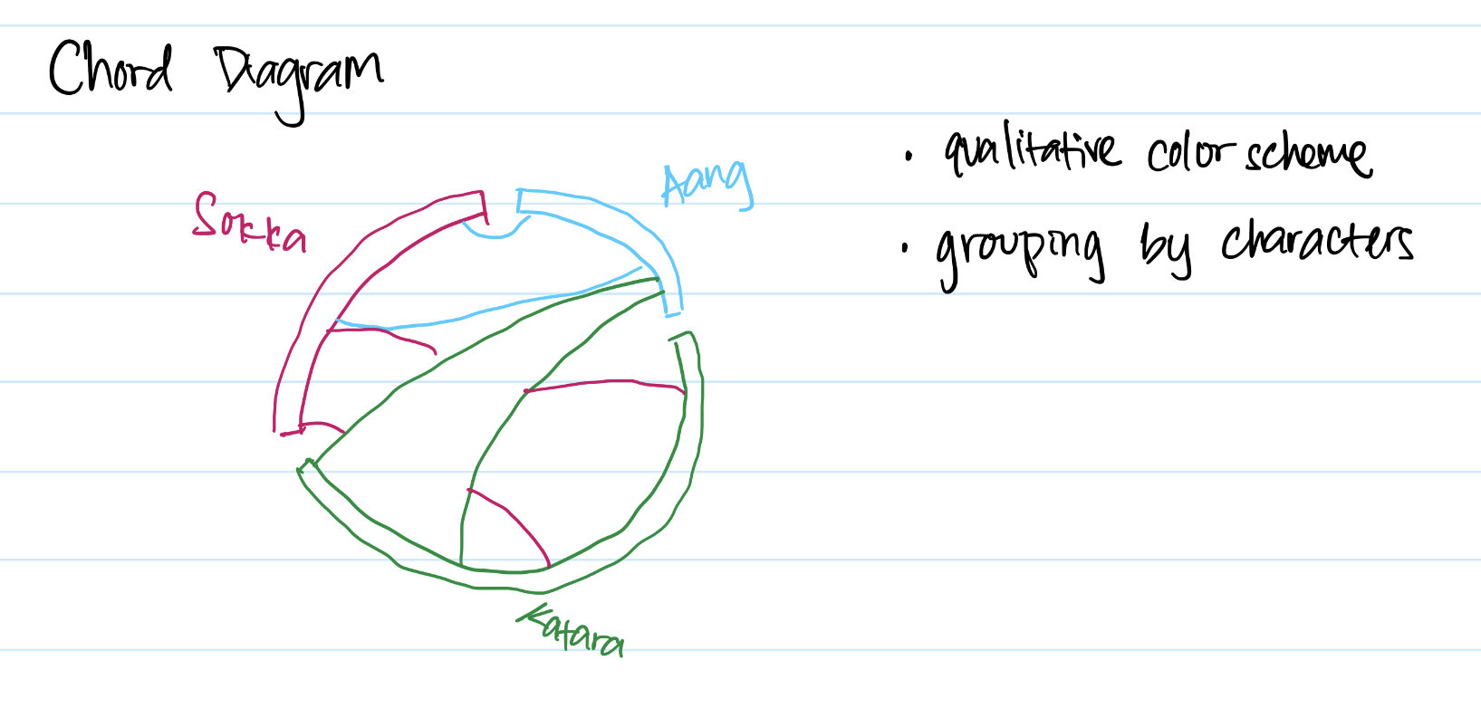
This mockup was created with the main 3 characters in mind. In this simple design, we knew we had to use qualitative color scheme since we had to be able to individually identify the characters and who they talk to. We ended up using the top 12 characters in the show, which is probably the maximum number of characters, otherwise it would be too cluttered.
4. Barchart - How many episodes did they appear in?
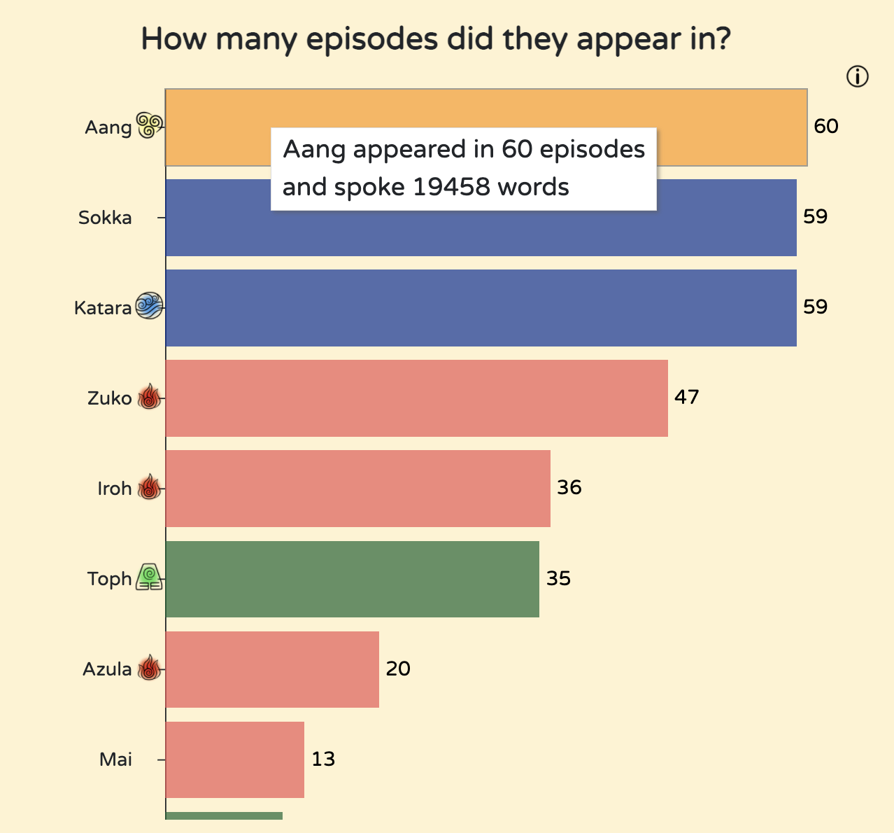
The bar chart displays how many episodes each character had at least one line in, sorted by characters with the most screentime. Next to the character name is a symbol of their nation if they are a bender.
When the user hovers over each bar, a tooltip shows with how many episodes and total words they've spoken in the series.
The bar chart is also scrollable - this was a design decision made so that we wouldn't have a huge barchart that was very tiny.
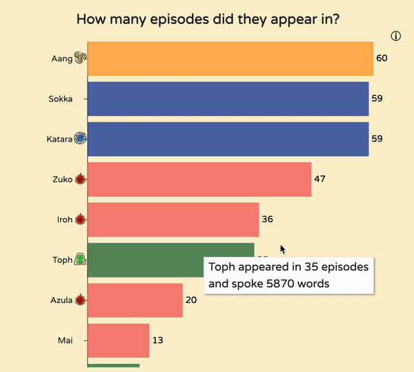
The bar chart is also scrollable - this was a design decision made so that we wouldn't have a huge barchart that takes up too much of the screen.
Design Sketches/Justifications
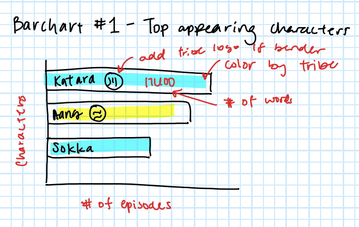
This mockup was our first idea of what the barchart woud look like. We ended up having to change some of the design, such as the placement of the bender symbols. While we wanted it to be inside the bar itself, some bars were too small to contain the symbol. Therefore, we put it near the tick instead, where there would be enough space. The coloring scheme was based on the nationality of the character (Fire, Water, Earth, Air). This is similar to the pie chart, with the same color scheme (specifically earth - #063, water - #039, fire - #e55, air - #FF9900, non-national - #9932cc).
We also wanted to have the number of words spoken on the bar of the barchart, but we decided that would be confusing to the user - whether the barchart was showing number of appearances or words spoken. We placed that information in the tooltip with a description that would make sense.
Insights
Using our visualizations, we were able to discover many insights about the series that we would have never known otherwise.
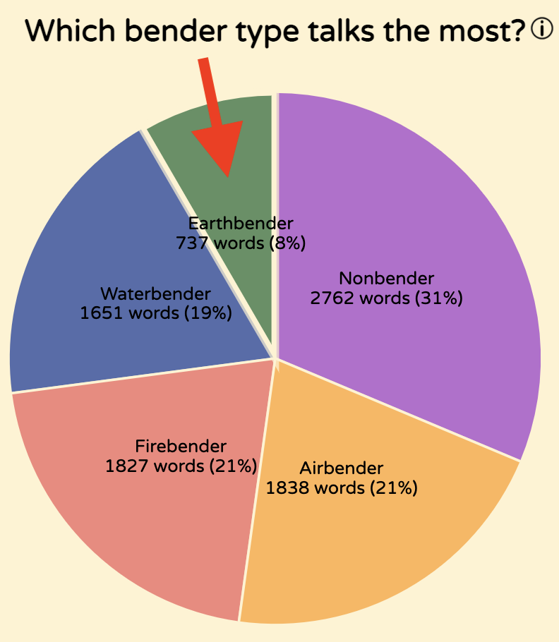
It was very apparent that earthbenders generally had far less lines than any other bending discipline, even if season two - notorious for including notable earthbenders.
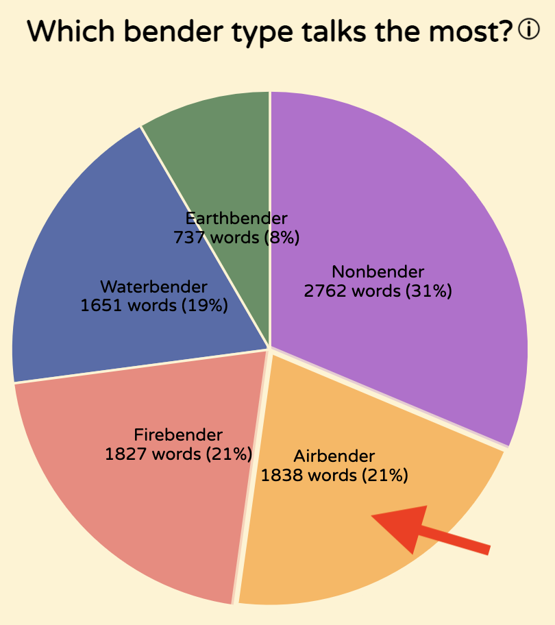
Also, related to the pie chart, it is worth noting that Aang - the only airbender with a significant proportion of dialog - speaks more lines than all of the main firebenders in the series combined.
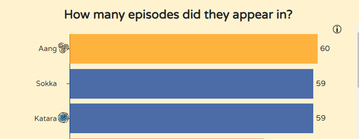
Additionally, we noticed that Sokka, although not the main character of the series (Aang), speaks 433 more words than Aang. We assume this is because Sokka tends to elaborate on jokes and plans in often verbose ways, whereas Aang tends to be more direct.
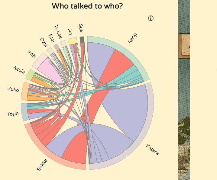
Katara always references other main characters significantly more than other characters reference her. This is especially interesting when looking at the references between her and Aang (who was her love interest throughout the entire series).
Process
Libraries used
- D3.js - JavaScript library for manipulating documents based on data
- Tabulator - Library for making easy and dynamic tables
Our code was structured with our classes having initVis(), updateVis(), and renderVis() functions to make re-rendering vizzes easier. We assigned work using GitHub Issues and made pull requests when we had updates. Each pull request required a reviewer so that we could keep track of each other's work and do quality checks. Styling was done using SCSS.
To run the code, run "python3 -m http.server 8000" in the terminal within the project folder. This requires the http.server library.
Or even easier, check out our website here
The code can be viewed on Github.
Demo Video
Division of work
| Name | Contribution |
|---|---|
| Bryan Cora | Data retrieval Data cleanup Chord diagram matrix Bar Chart initial creation |
| Daniel Hackney | Word cloud Pie chart Character icons functionality Season/Charactor filtering |
| Lina Kaval | Table Bar chart fixing Site UI cleanup Episode filtering Table modal |
| Samantha Shaw | Chord diagram Site color scheme and background Character icons design |