Project 2 - Visualizing Cincinnati 311 Call Data for CS 5124
Introduction
The motivation behind this project was to be able to create a dashboard where information about the 311 calls made in Cincinnati in 2022 could be viewed.
You may be wondering, what is 311? 311 is the number used for all non-emergencies, whether you need police for a non-emergency issue, or for any service provided by the City. On the other hand, 911 is for medical, fire, and police emergencies only. Source: https://www.cincinnati-oh.gov/
Our visualization specifically allows users to visualize where calls are being made, what day of the week most calls are made, what zipcode of Cincinnati calls are made from, what type of calls are made, the change in the number of calls made per day over time, and the number of days between a call issue being created and when it is closed.
The Data
The data was sourced from the City of Cincinnati's public dataset website. This website is maintained by the City of Cincinnati, allowing the public to interact with the data collected - government transparency is an important issue in civics. Although there are many years of data included in this dataset, we reduced our scope to just 2022, as required in our project. Information about each data column could also be found on the page.
When it came to grouping data from the status code (used in the map), we used the following website used for submitting 311 requests online to create our custom categories. Some status codes fit into multiple categories - so we had to use our best judgement to decide what goes where.
Visualization Components
Full Dashboard View
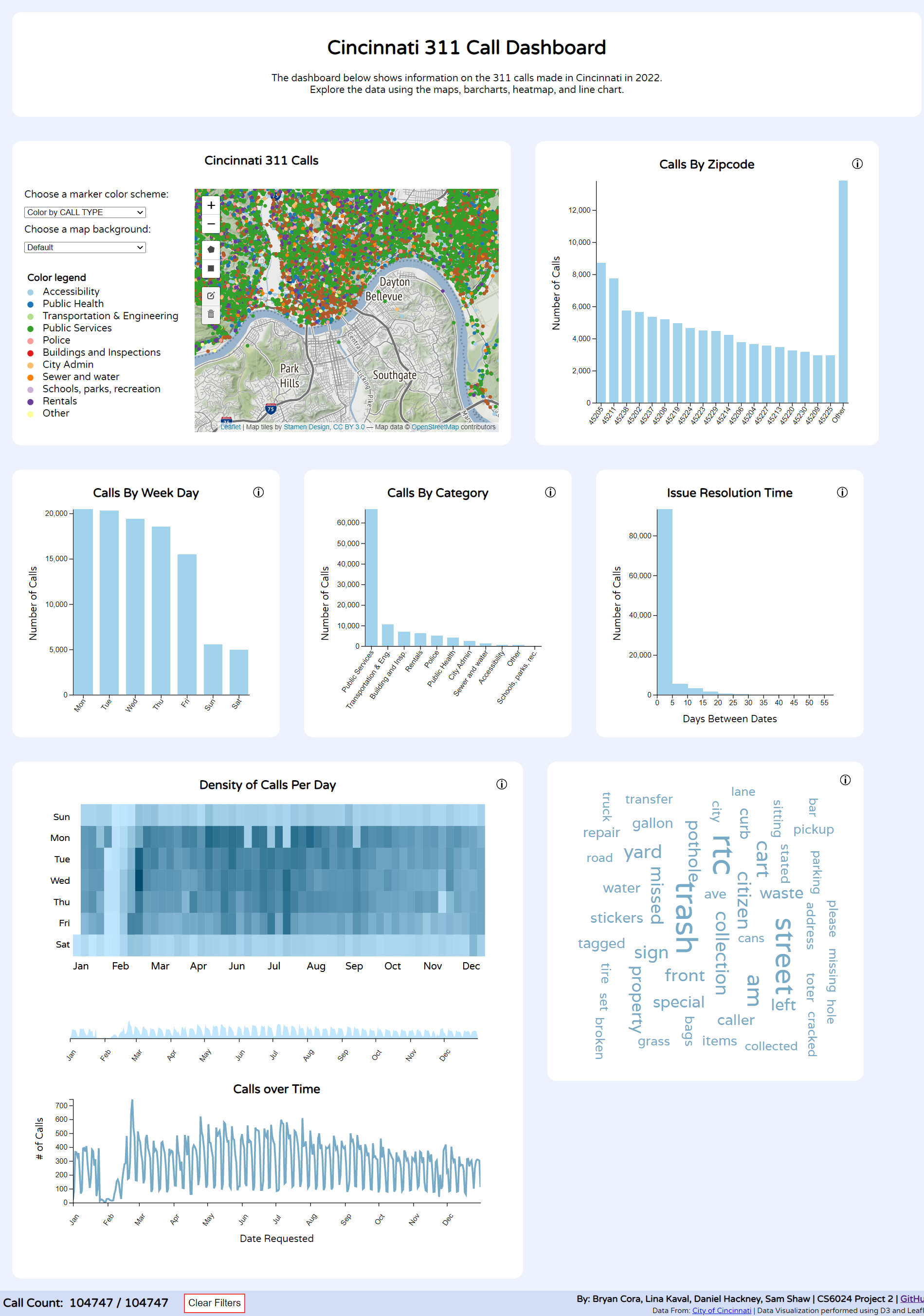
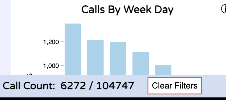
The whole dashboard can be filtered using the barcharts and brush. The filtering updates to every other visualization on the dashboard. At the bottom of the page, there is a button to clear filters and display the number of calls that are currently shown on the page.
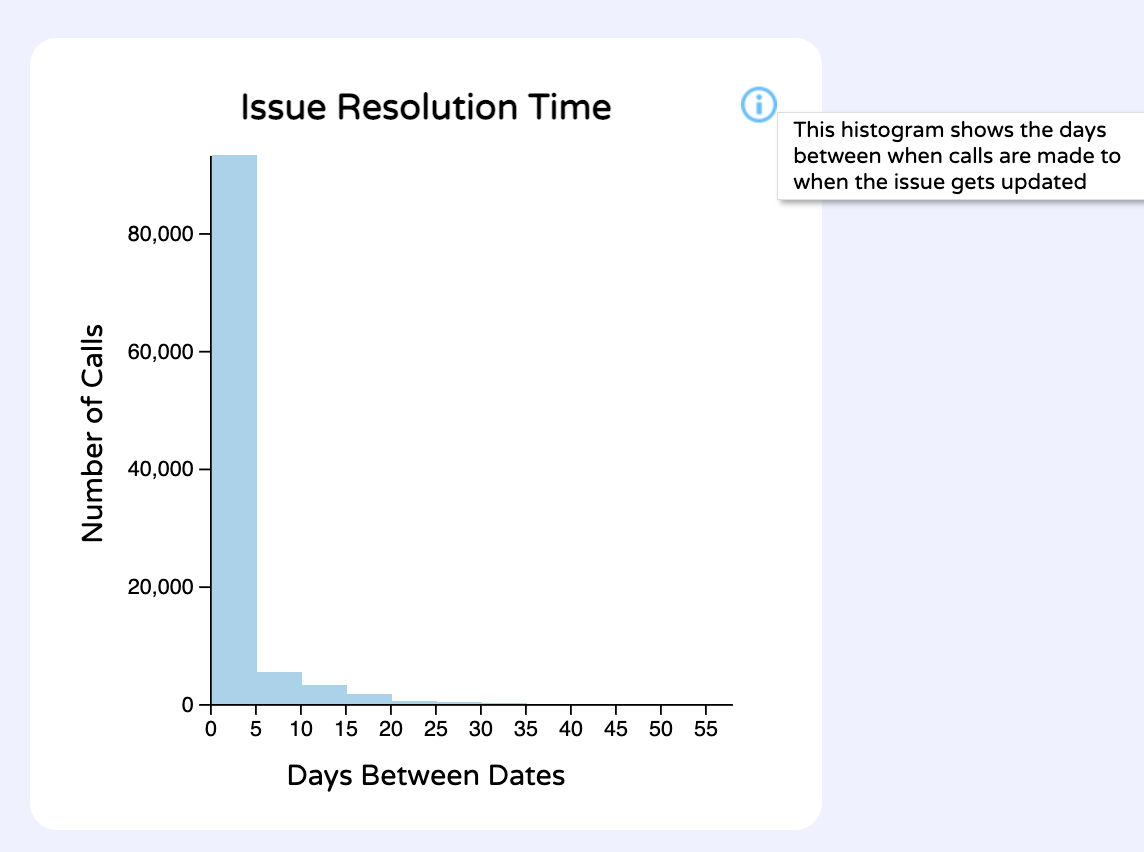
Most of the visualizations have an "i" button to display info to the user on how to use/interpret the visualization.
Map
View of the data
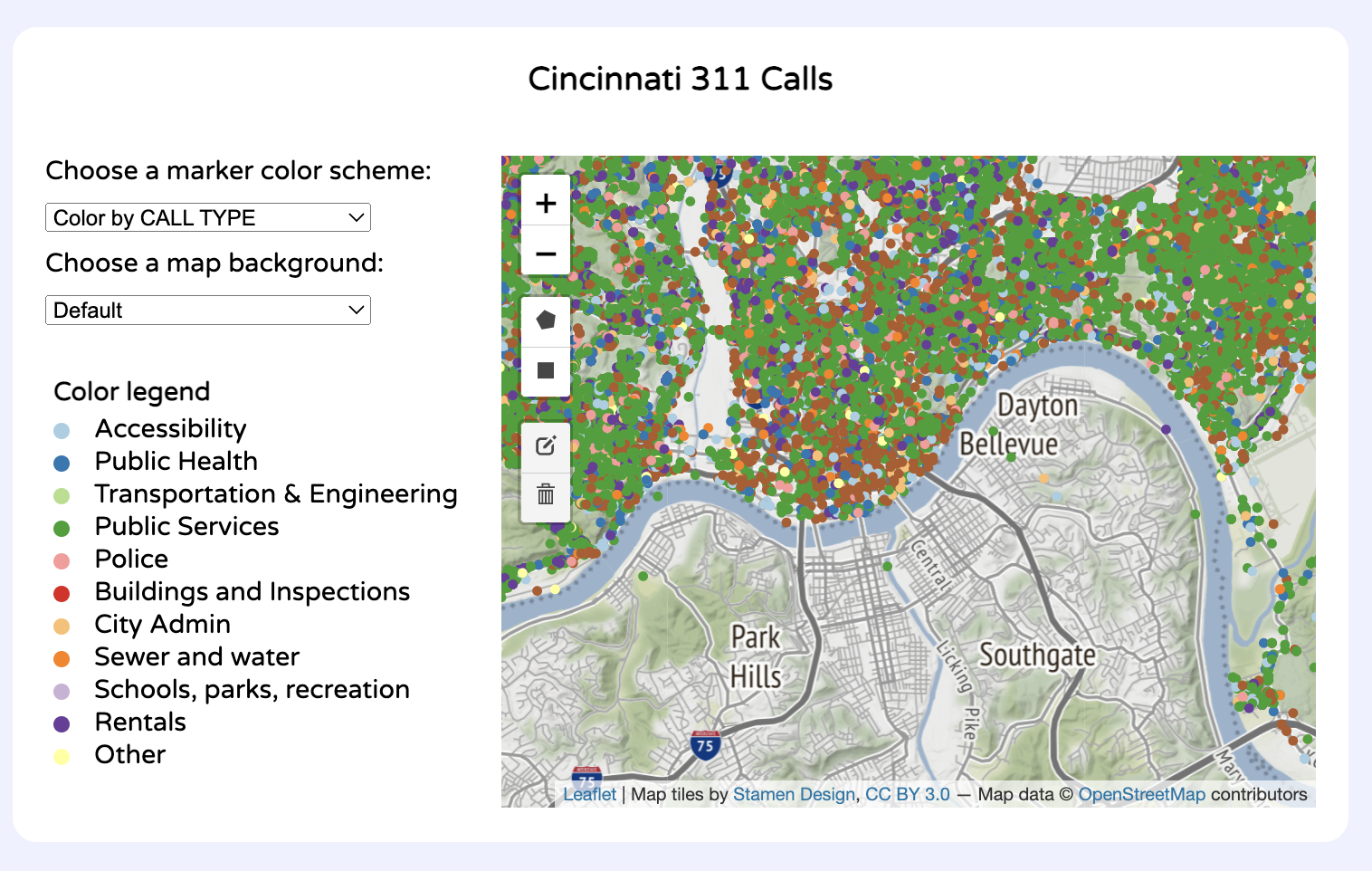
UI/Interactions
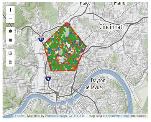
Multi-Polygon Selection Filtering - Users can draw multiple polygons on the map to only include calls made in those regions. These shapes can also be edited and deleted.
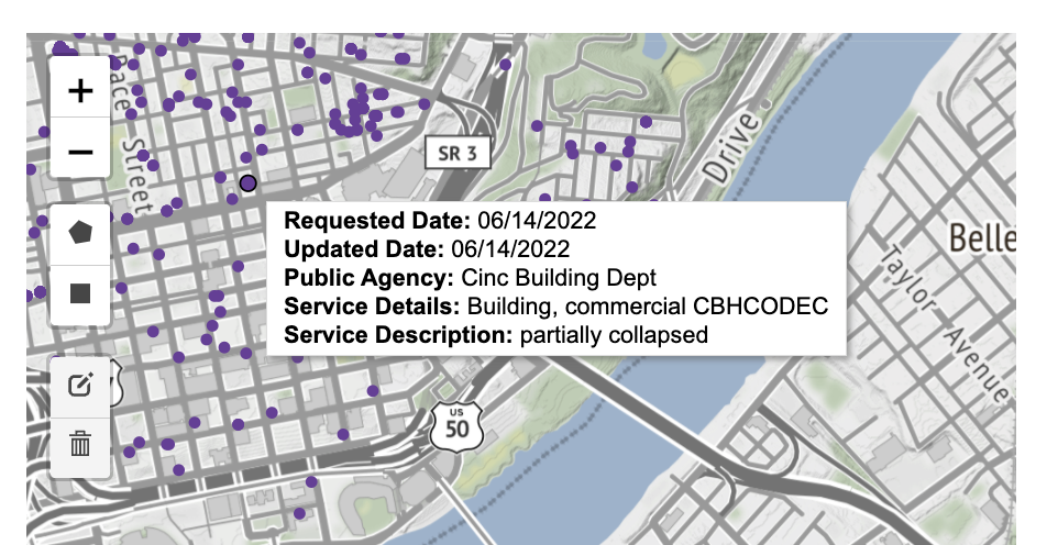
Tooltip - Users can hover over each data point to view more information about a specific call.
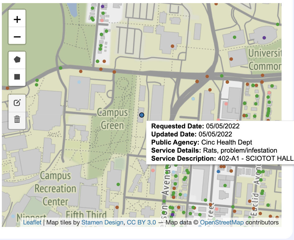
Clicking a data point will bring users to a zoomed in version of the map surrounding the selected data point.
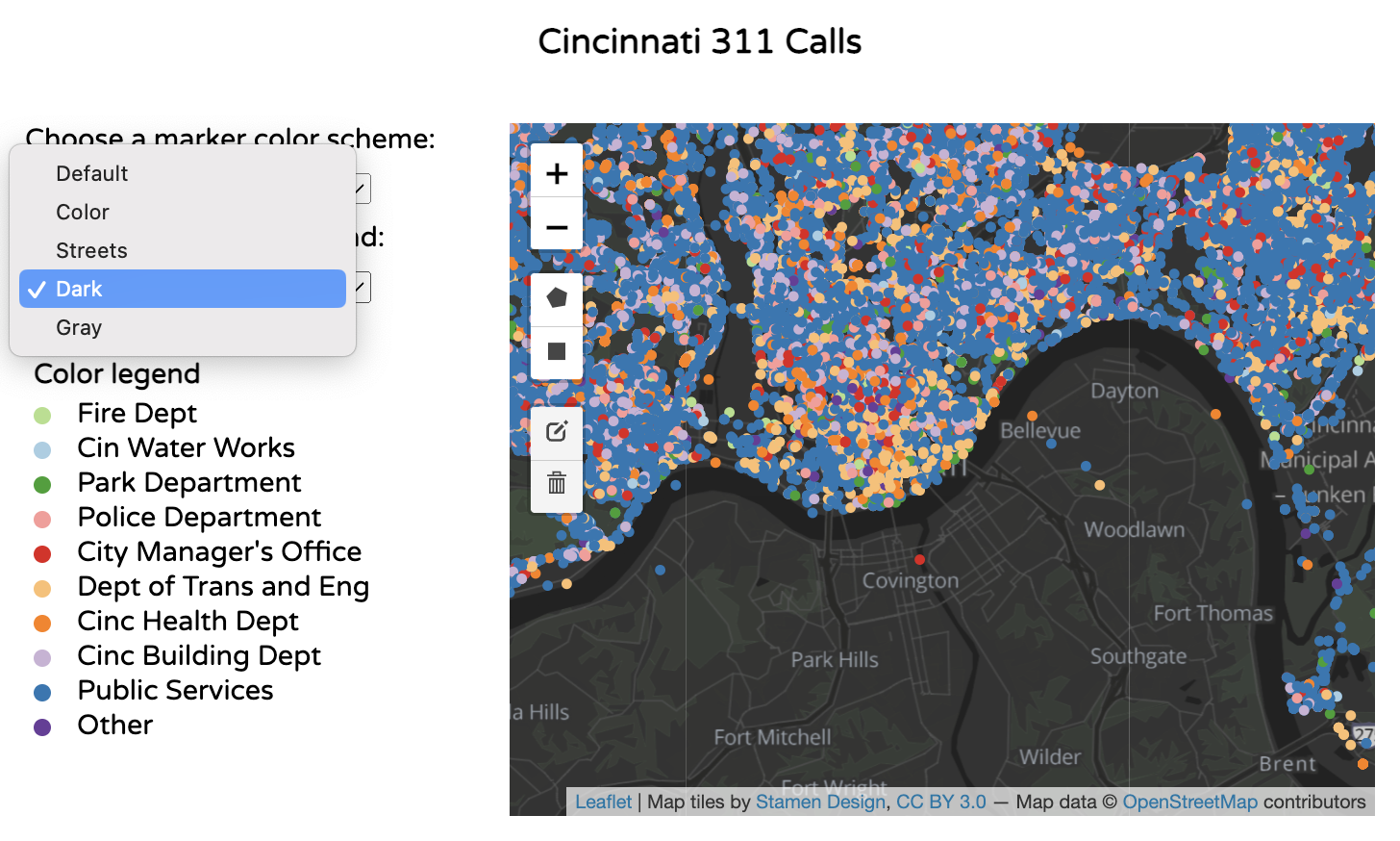
The user can choose multiple map background options. The options are: Default, Color, Streets, Dark, and Gray.
Category and color decisions
| Dropdown | Type of Data | Color Scheme | Type of Color Scheme |
|---|---|---|---|
Color by CALL TYPE 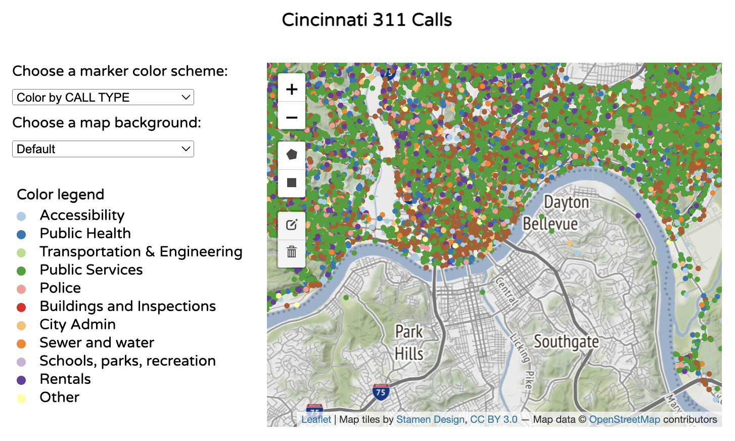 |
Nominal (Qualitative) | d3.schemePaired | Categorical Because we were working with qualitative data, we knew we had to use a categorical color scheme. We used d3.schemePaired because it had the most color options for categorical data. |
Color by TIME BETWEEN REQUESTED DATE AND UPDATED DATE 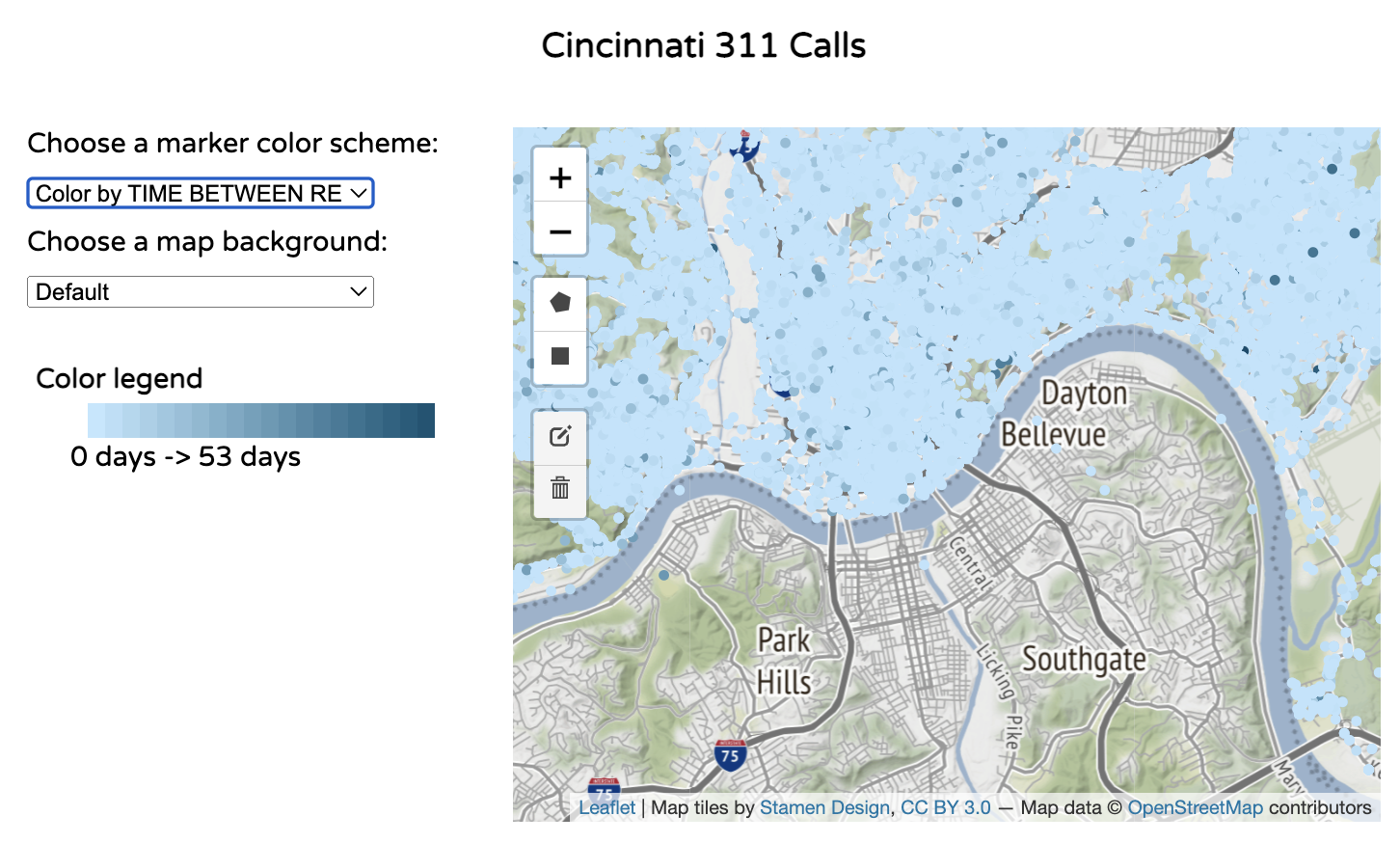 |
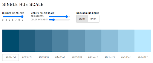
Interval (Quantitative) | Range from [“#c1e7ff", "#004c6d”] | Sequential/Monochromatic (Single-Hue) Interval data is best paired with a sequential scale. We did not use a diverging scale because there was no midpoint in our data. We chose colors that were blue to match the rest of the color scheme we were using across the dashboard. |
Color by DAYS IN THE YEAR 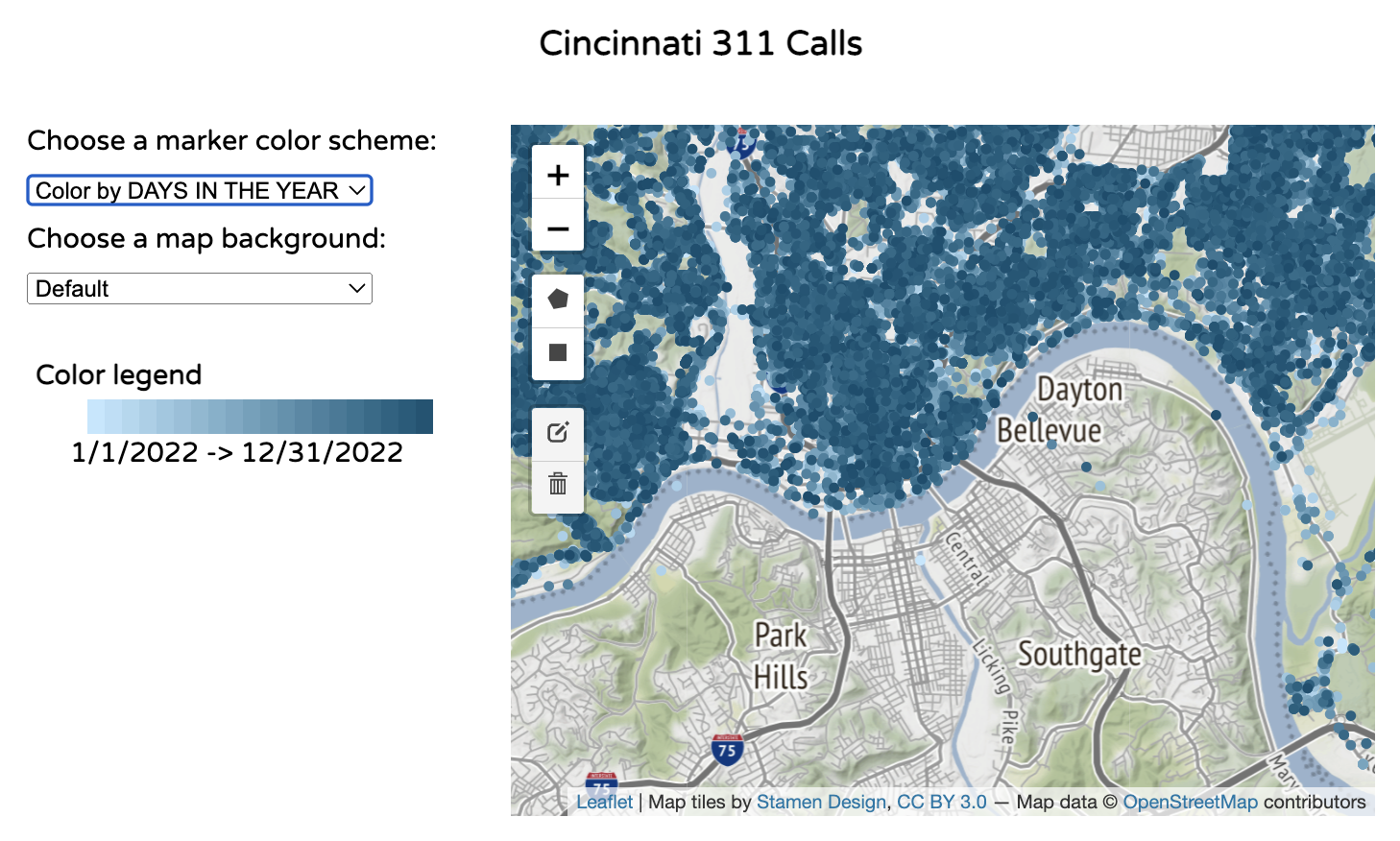 |
Interval (Quantitative) | Range from [“#c1e7ff", "#004c6d”] | Sequential/Monochromatic (Single-Hue) Interval data is best paired with a sequential scale. We did not use a diverging scale because there was no midpoint in our data. |
Color by PUBLIC AGENCY 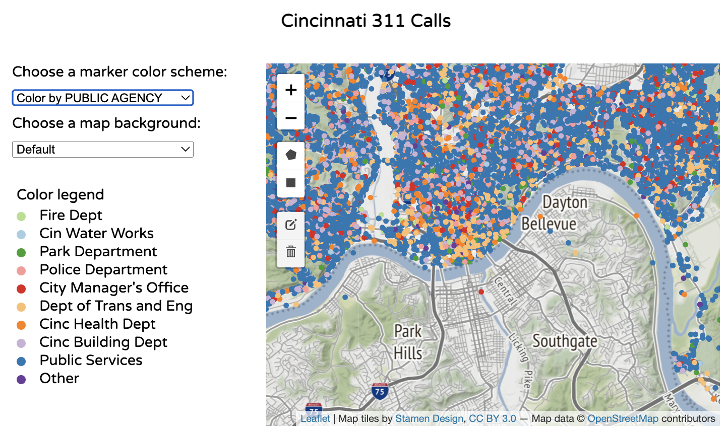 |
Nominal (Qualitative) | d3.schemePaired | Categorical Because we were working with qualitative data, we knew we had to use a categorical color scheme. We used d3.schemePaired because it had the most color options for categorical data. We chose colors that were blue to match the rest of the color scheme we were using across the dashboard. |
Barcharts
The visualizations below all use the barchart.js file.
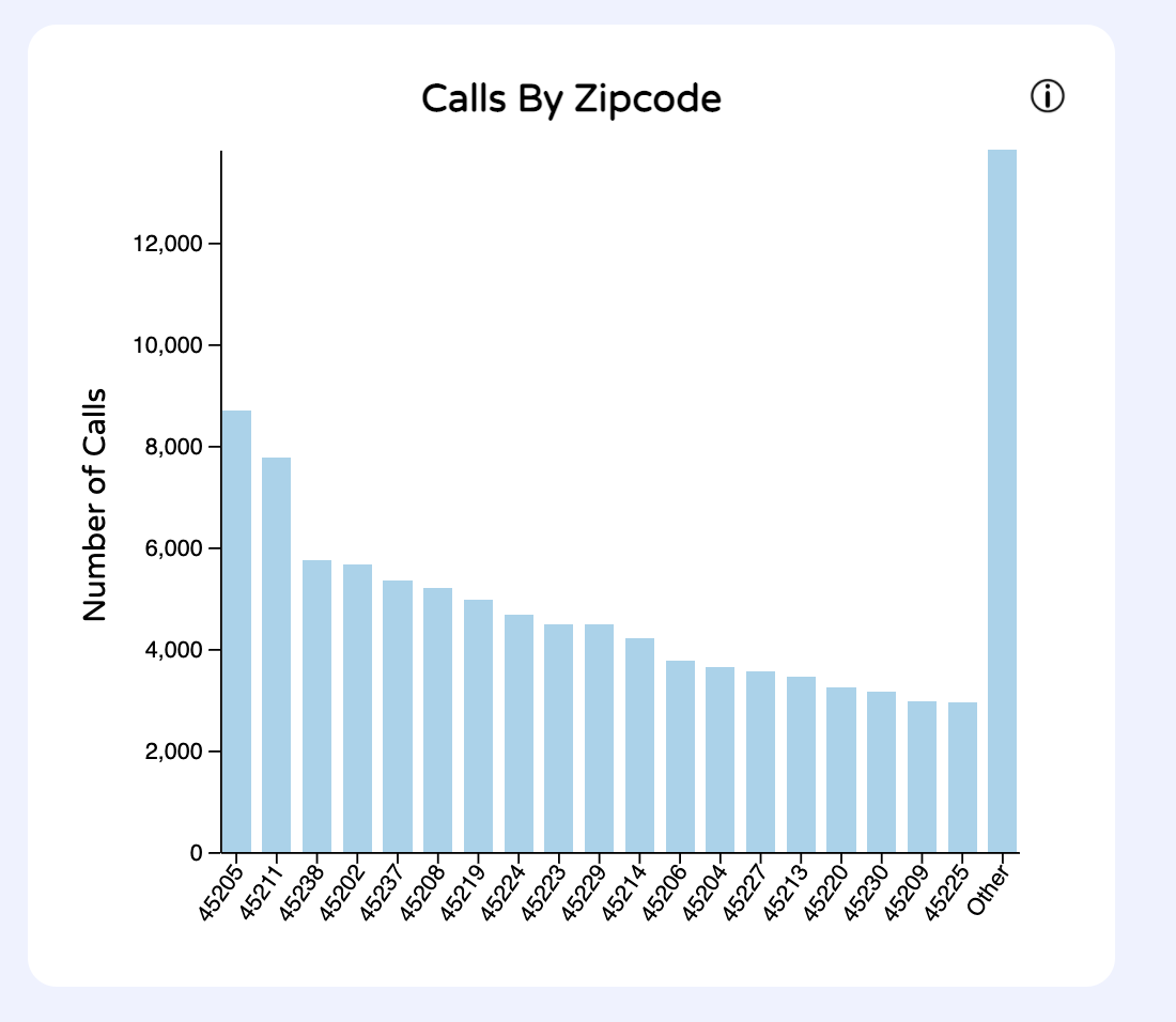
1. Barchart - Calls by Zipcode
UI/Interactions
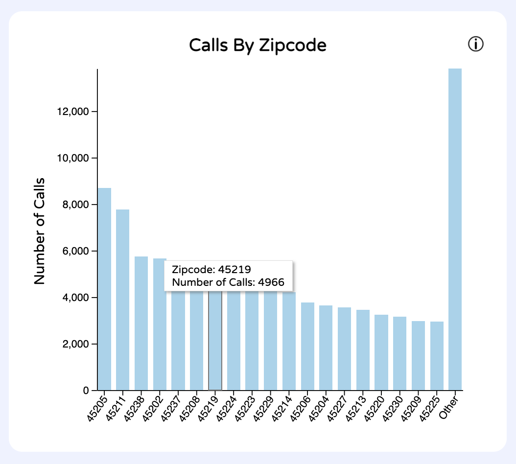
Users can hover over each bar to view more specific data (exact call count) for each bar.

Users can also filter other data by clicking on a bar. To remove the filter, the user can click again on the bar. This filter also works when the user clicks on the x-axis label for the bar.
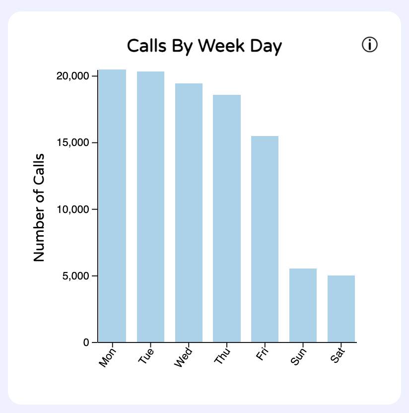
2. Barchart - Calls by Weekday
UI/Interactions
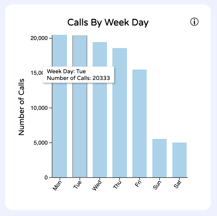
Users can hover over each bar to view more specific data (exact call count) for each bar.
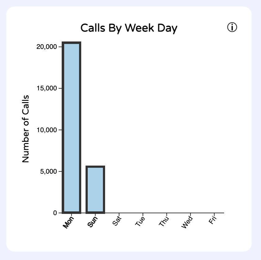
Users can also filter other data by clicking on a bar. To remove the filter, the user can click again on the bar. This filter also works when the user clicks on the x-axis label for the bar.
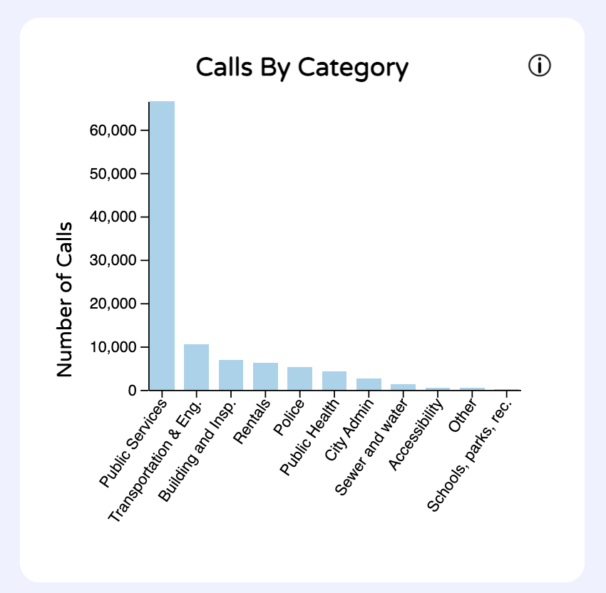
3. Barchart - Calls by Category
UI/Interactions
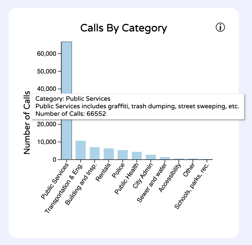
Users can hover over each bar to view more specific data (exact call count) for each bar.
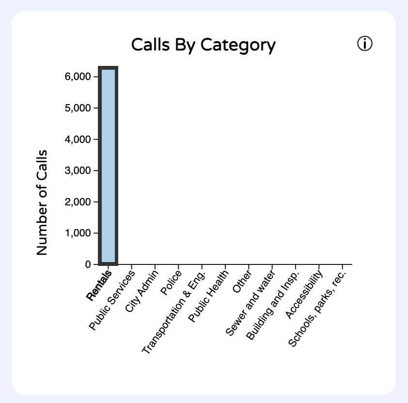
Users can also filter other data by clicking on a bar. To remove the filter, the user can click again on the bar. This filter also works when the user clicks on the x-axis label for the bar.
Timeline - Calls over time
View of the data
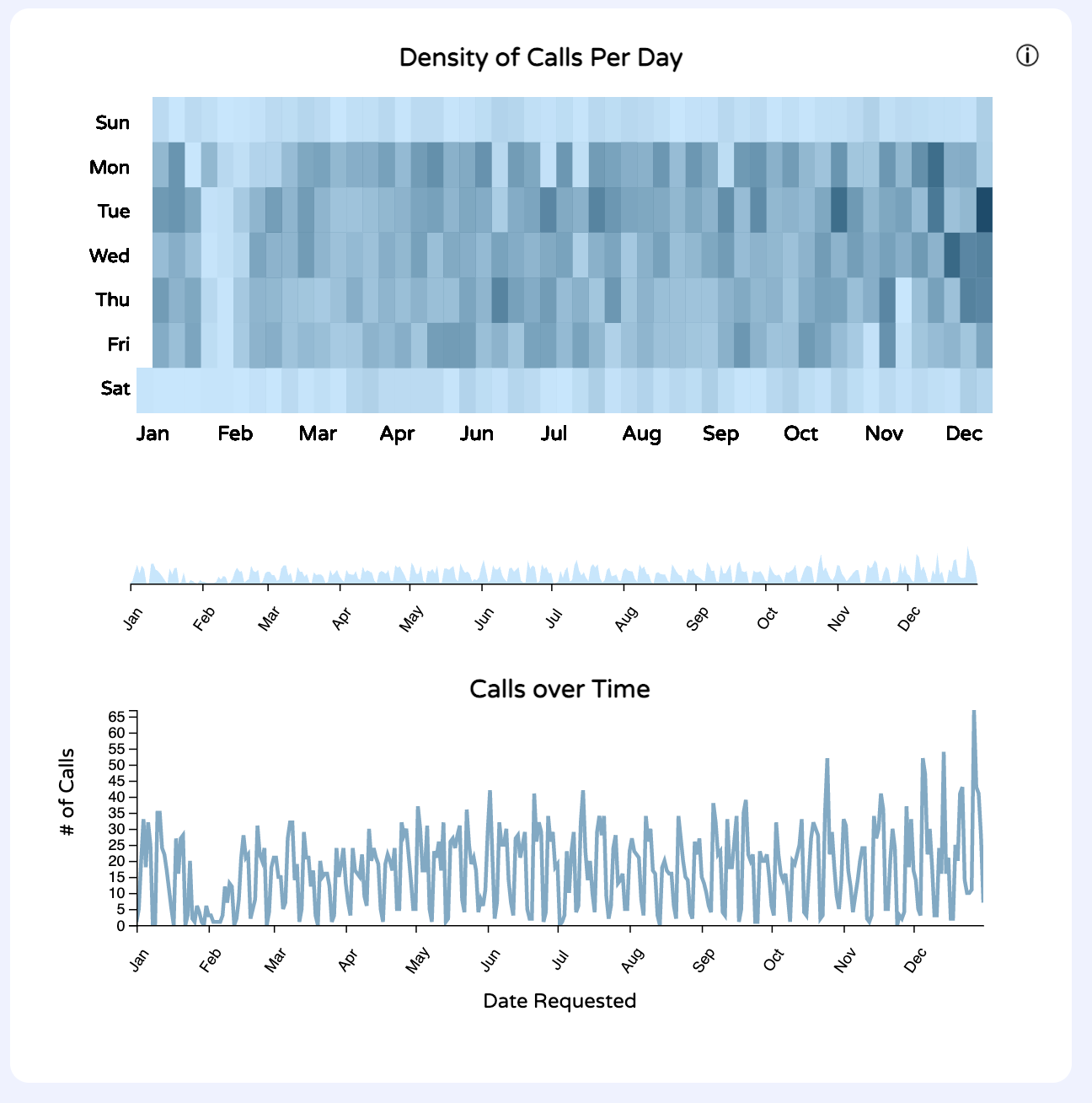
This cluster of components all work together to show time series data to the user. The first component is the calendar heatmap. What I like about this visualization is that you can see different trends at once. For example, by focusing on the rows, I can see that Sundays and Saturdays have the least calls. This makes sense - for a non-emergency line, more people are likely to make calls during the workweek about a traffic light being down or water pipe leak.
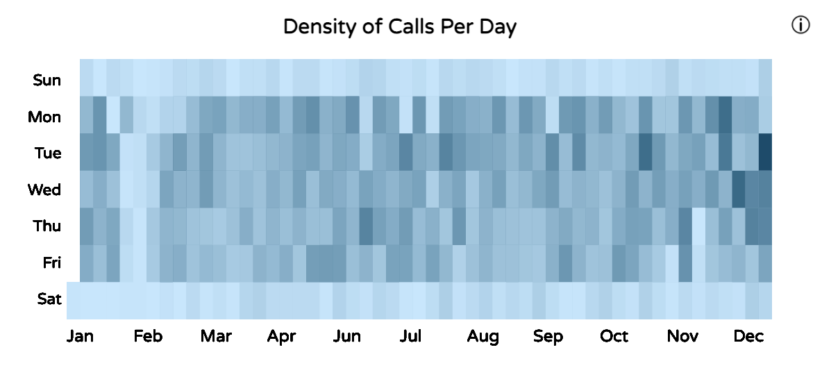
Another insight the user can gain is being able to see when the most calls were made in the whole year, by looking for the darkest rectangle in the heatmap. This looks to be 2/23/2022 with 745 calls.
We can also see an abnormally light day surrounded by dark days in November. By hovering on the light day, we can see that it was Thanksgiving Day - a holiday so not many people would make calls.
The other component is the line chart of the time series data with calls made over the year. While it may be a boring way to display information, it is something that users are used to viewing and analyzing. We can confirm that the highest call count made in 2022 was 745 calls.
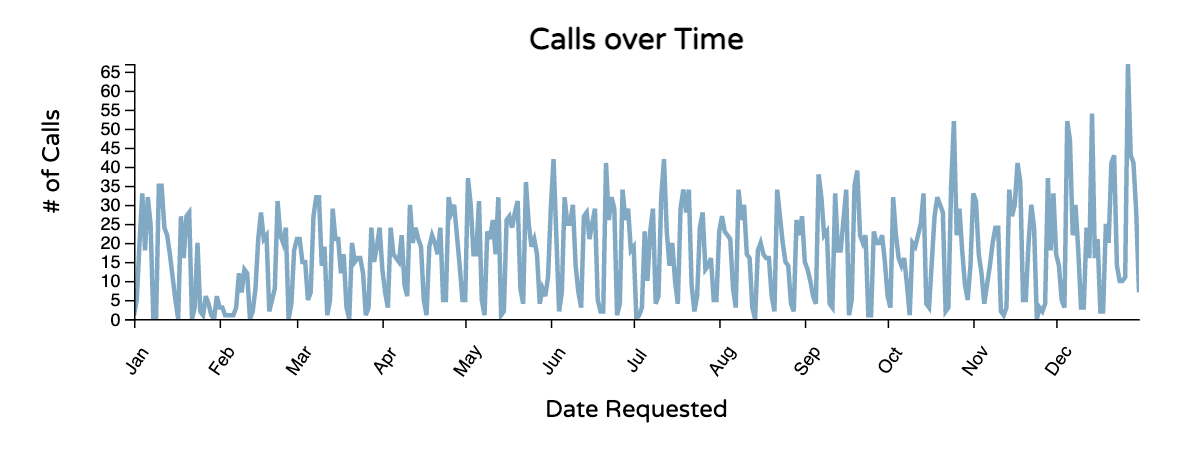
The user can also gain insight on whether calls increase over the year. There is no obvious trend to indicate that is true.
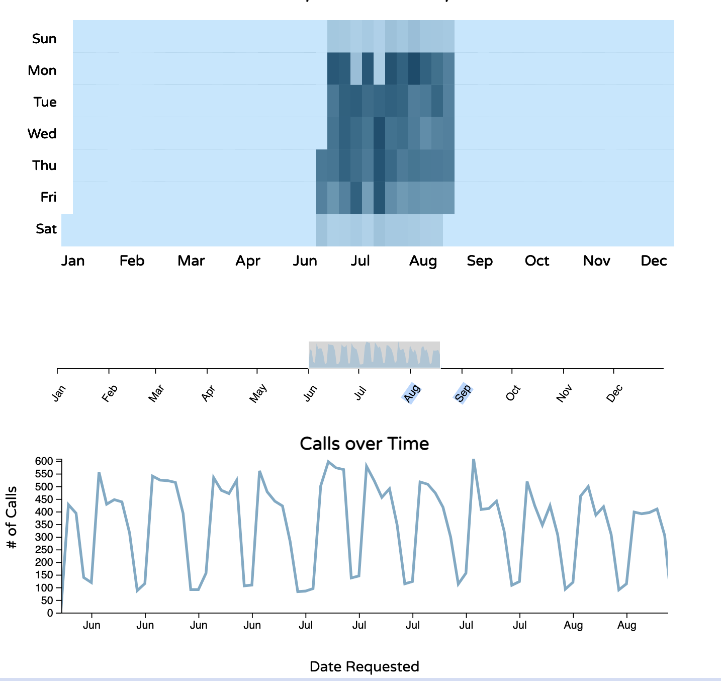
The brush between these two components allows the user to zoom in to specific periods of time on both the heatmap and the linechart.

UI/Interactions
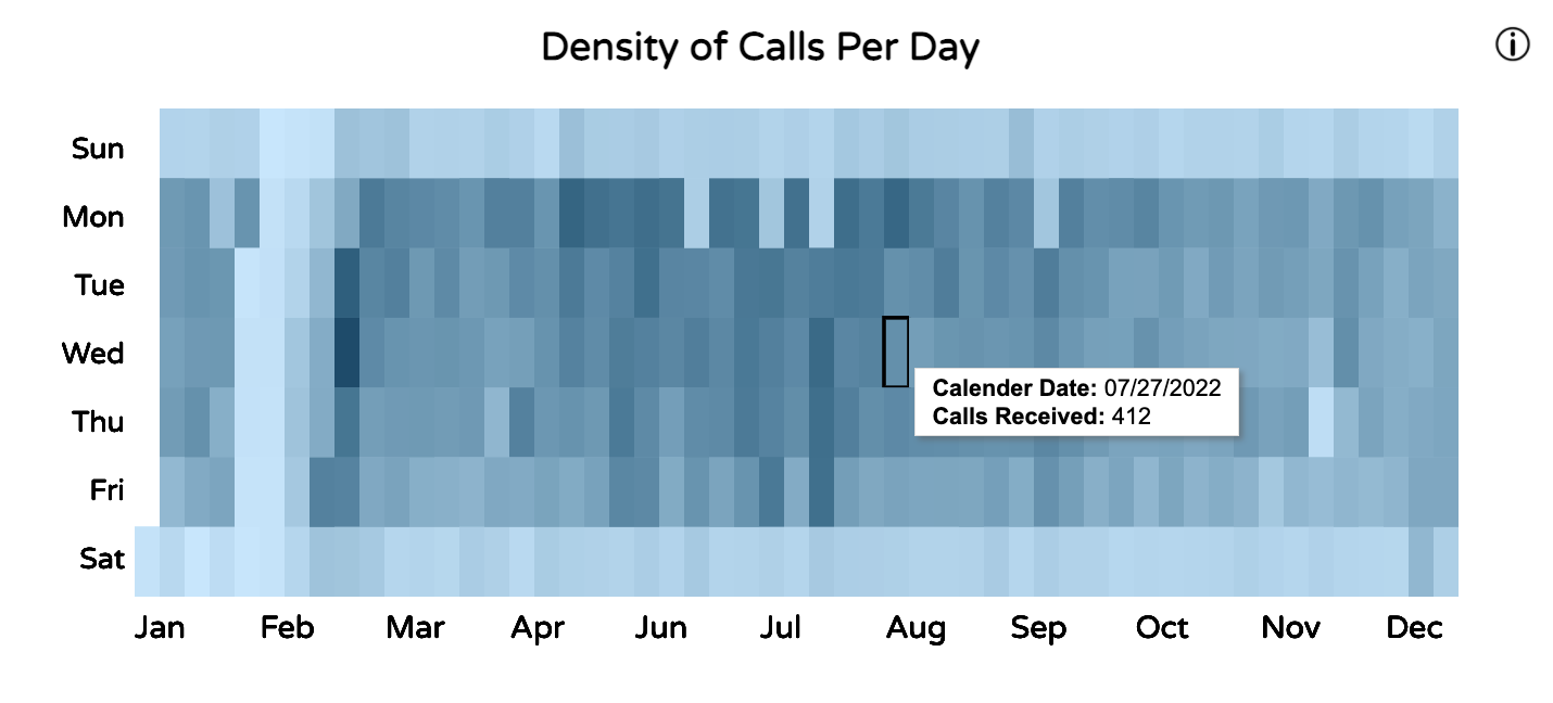
Users can hover over each rectangle on the calendar heatmap to view more specific data (exact call count and date) for each rectangle.
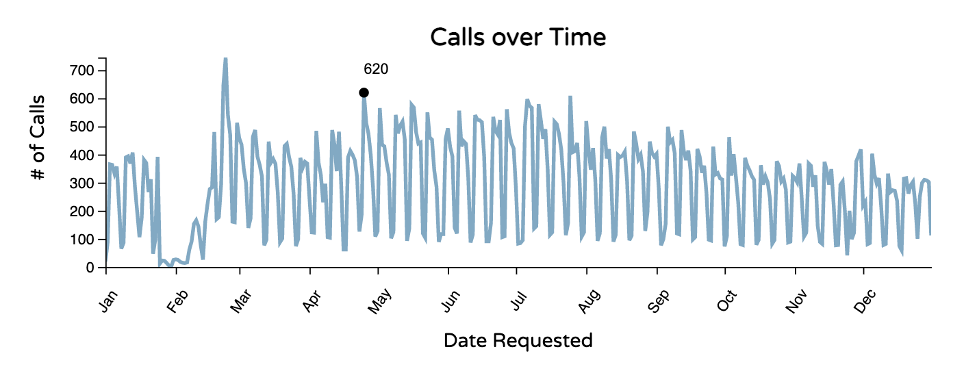
Users can hover over points on the line chart to view more specific data (exact call count) for each point.
Histogram - Days Between Call Received and Issue Updated
View of the data
UI/Interactions
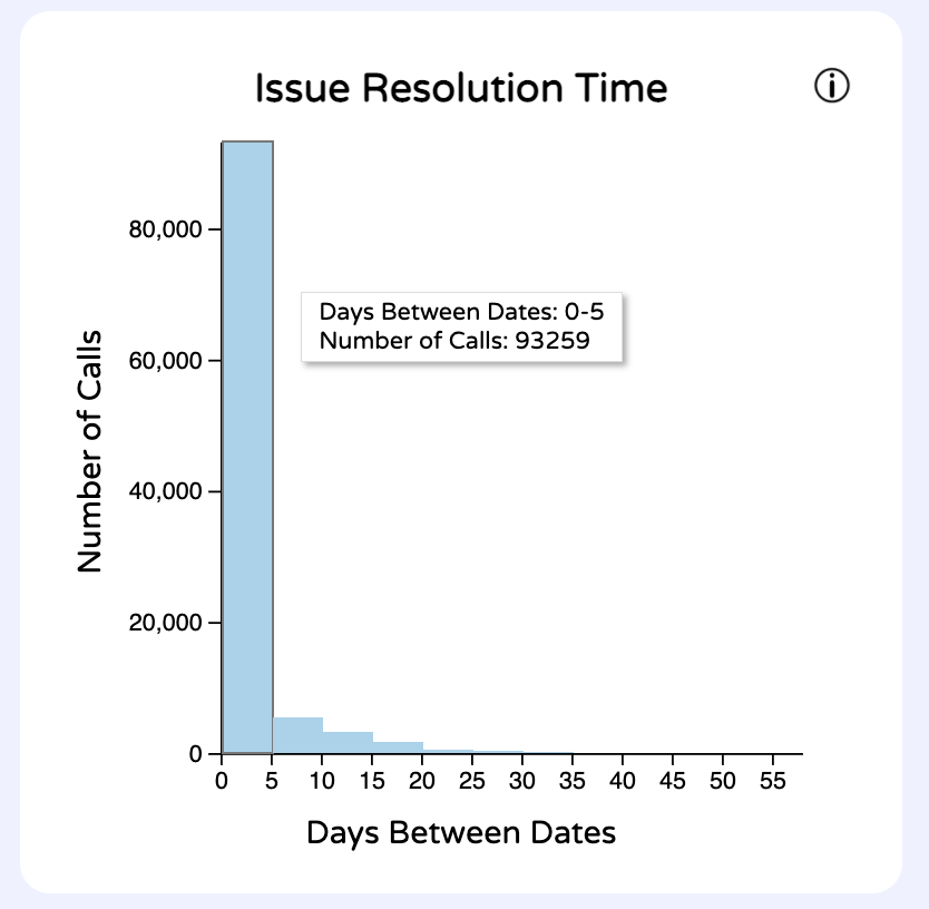
Users can hover over each bar to view more specific data (number of days to resolution and exact call count) for each bar.
Word Cloud
View of the data
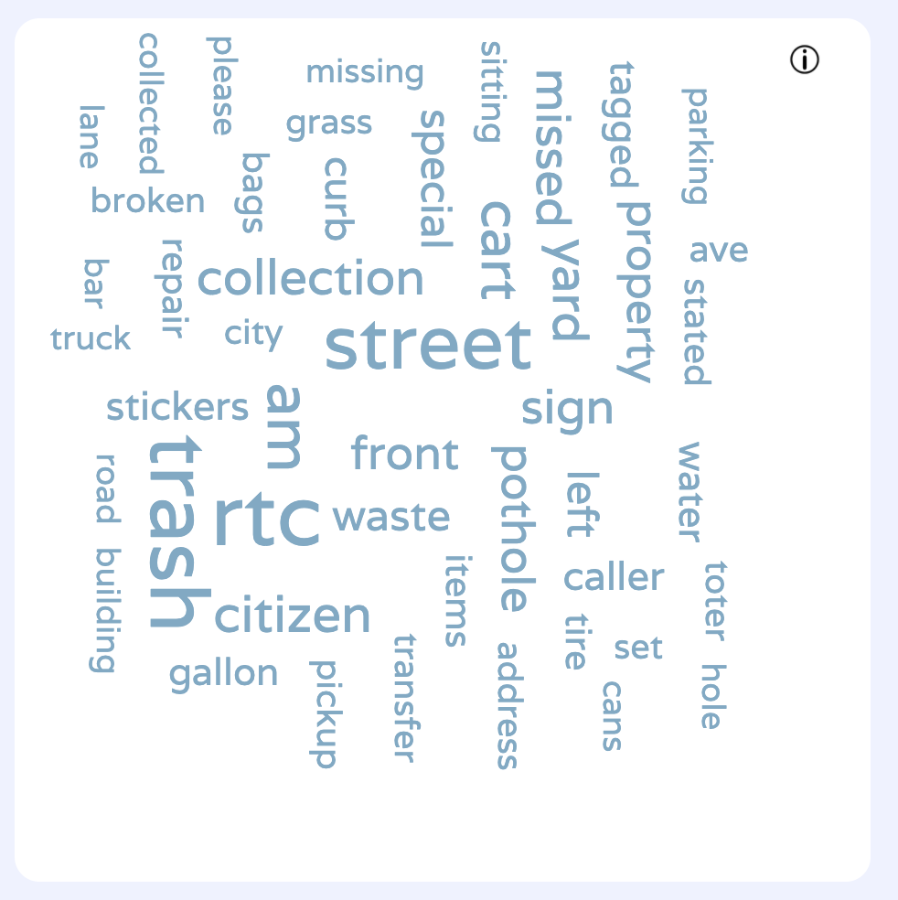
This word cloud gets the statusses of each call and creates a frequency table of the most popular words. Stop words such as "is", "or", were filtered out so that the user could gain value from the word cloud.
Sketching and Design Justifications
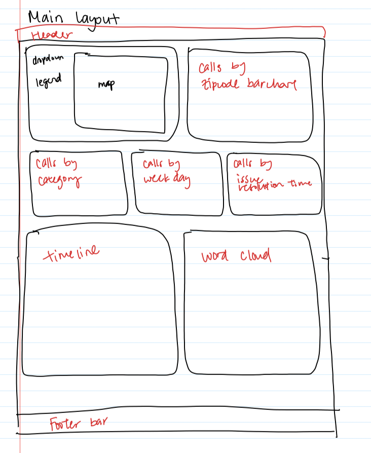
The dashboard has many parts to it. Sketched below is how we decided to fit everything nicely.
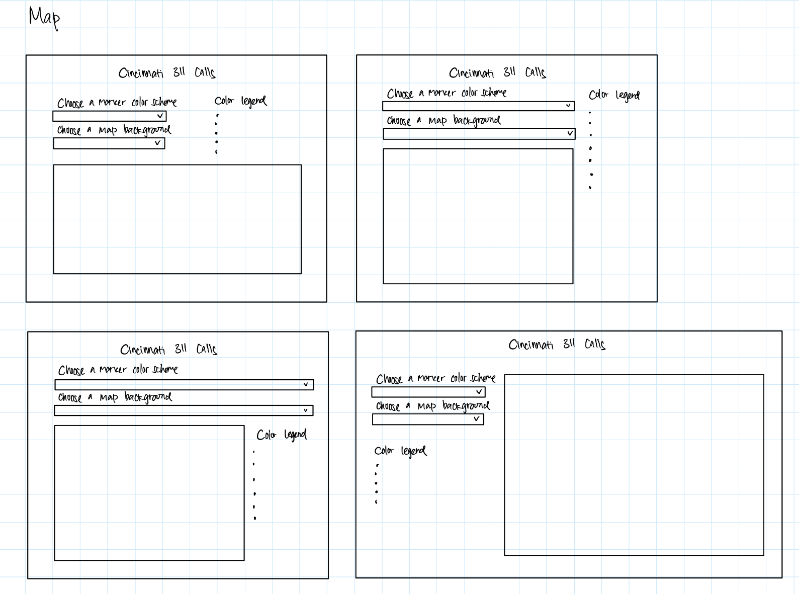
Below is the different ways we thought of fitting the map components together. We went with the last option because it looked cleanest to us. We also didn't have to worry about the changing length of the legend items since we wouldn't put anything under the legend.
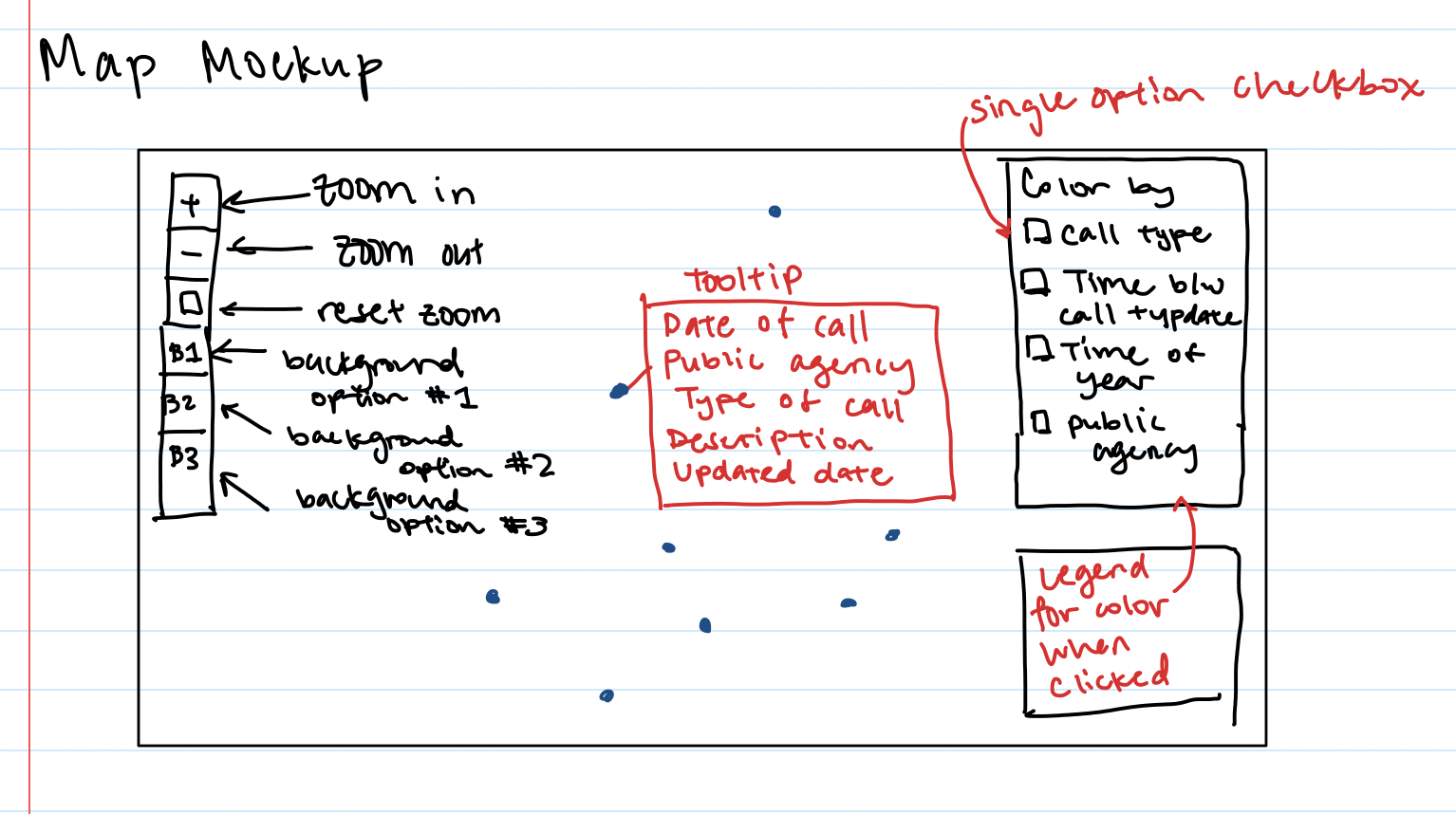
Below is another view at just the map and fitting the components together. We did not go with this design because it cluttered the map space. Instead, we put everything outside the map.
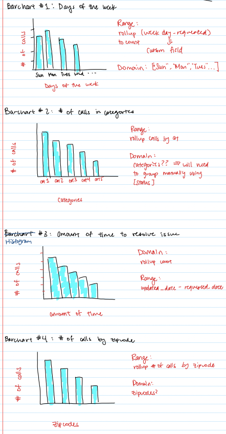
Below is the sketches of our bar charts and where the data would come from.
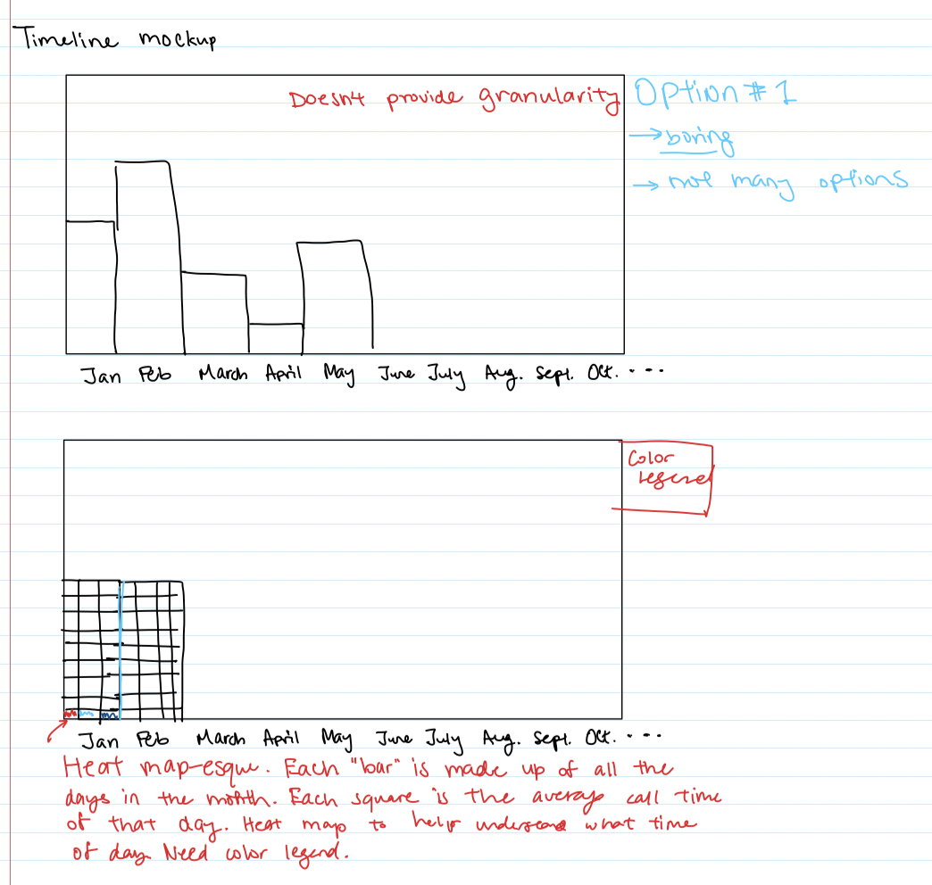
Below is the brainstorming of our timeline component. We felt that traditional visualizations like line charts or bar charts wouldn't be able to tell us as much information as another kind of visualization. That is when we came up with the heatmap. This allows the user to see trends over both weekdays and across the year.
Color Palette
We decided with a neutral blue color to use for our entire dashboard. Sticking to one color palette creates uniformity within our dashboard. This was important because with all of us working on different parts of the dashboard, we needed to make sure we could tie up all the work into looking like it fit together, rather than some things we just threw onto a screen.
Insights
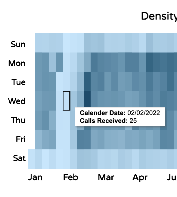
Using the timeline, we can see a pattern - from 1/25/2022 to 2/4/2022, it is much lighter (meaning fewer calls were made). While I don't see anything in the news that may explain the lack of calls, the user could maybe consider the scenario that perhaps the 311 call system was down during this period. This is something that the user may be interested in diving into further.
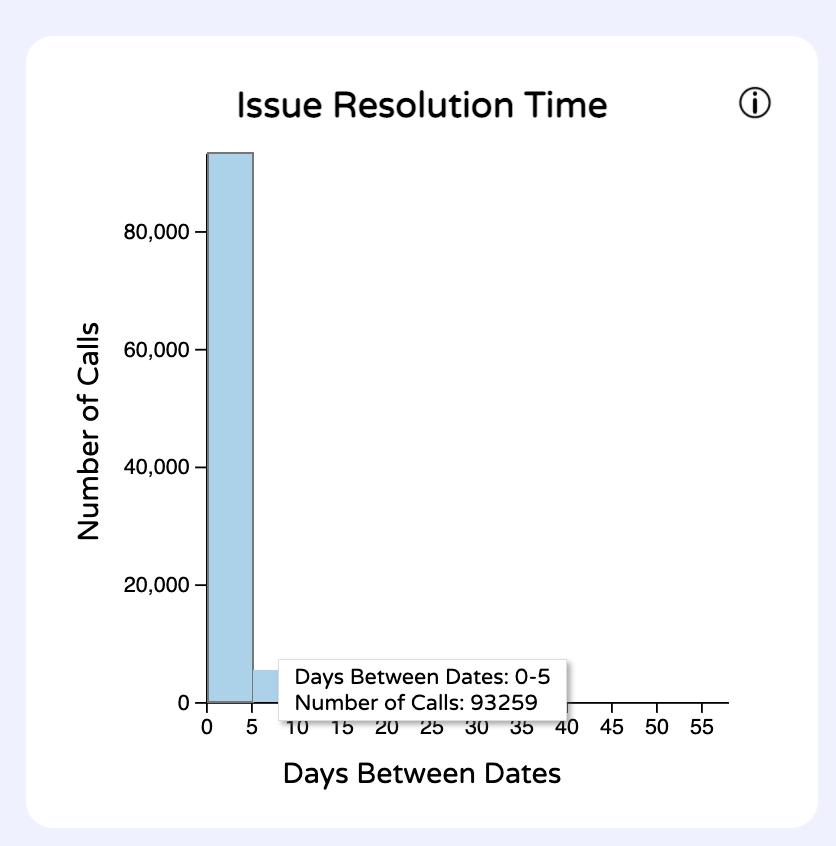
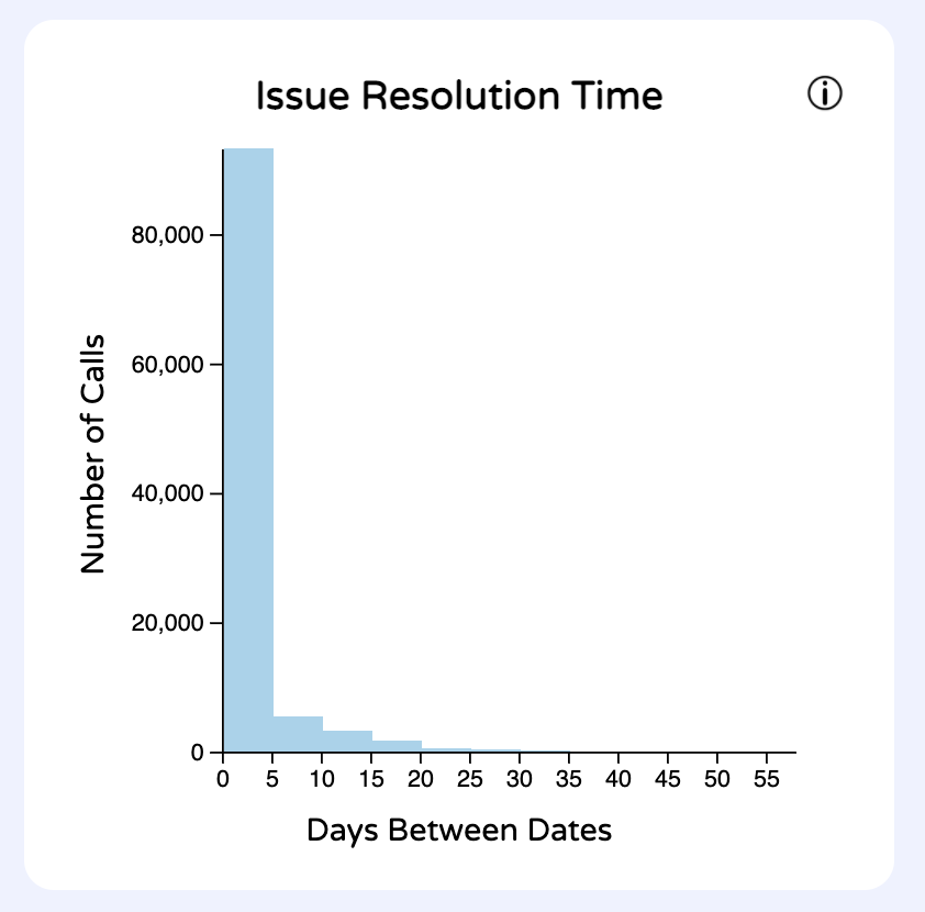
Users can gain insight on the data by seeing that most calls get resolved within 5 days. Users can also see that the longest time it takes to resolve an issue is around 55 days.

Curiously enough there are significantly less 311 calls on the weekends. This can be seen either in the daily barchart or the timeline/heatmap. I suspect that this might arise from people not being out or concerned about non emergencies on the weekend. Another contributing factor might be that people are more inclined to call it in on the way to work or first thing in the morning then when they are out with family.
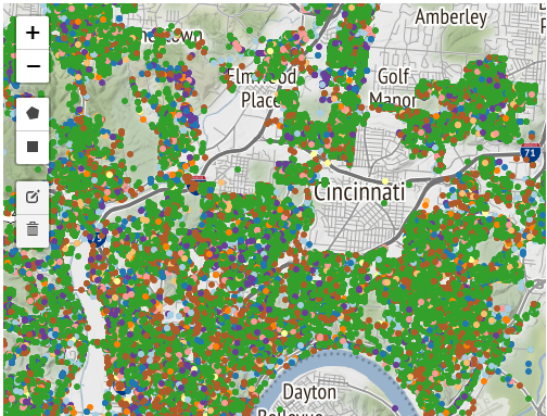
There are many discoveries users of our application could make by filtering and observing the data. One immediate observation that can be made is by looking at the map view. It is clear to see that some communities do not utilize the public Cincinnati 311 call system at all, despite being within the greater Cincinnati area.
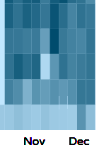
As previously mentioned, users will quickly notice that far fewer calls are made on weekends than weekdays, and during the latter half of January and first half of February the system may have been down. Far more calls are made relating to public services than any other category, and far fewer calls are made on holidays (see Thanksgiving below).
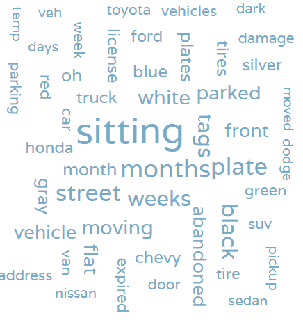
Additionally, users may notice trends in the data as they explore variations in the word cloud. For instance, nearly all calls in the “Police” category involve cars.
Process
Libraries used
- D3.js - JavaScript library for manipulating documents based on data
- d3-scale-chromatic
- Leaflet-Draw - Javascript library for map data
We also used map backgrounds from Stamen, OpenStreetMap, and Stadia Maps.
Our code was structured with our classes having initVis(), updateVis(), and renderVis() functions to make re-rendering vizzes easier. We assigned work using GitHub Issues and made pull requests when we had updates. Each pull request required a reviewer so that we could keep track of each other's work and do quality checks.
To run the code, run "python3 -m http.server 8000" in the terminal within the project folder. This requires the http.server library.
The code can be viewed on Github.
Demo Video
Division of work
| Name | Contribution |
|---|---|
| Bryan Cora | MAJOR data cleaning Timeline Heat map Description word cloud |
| Daniel Hackney | Calls by Weekday Barchart Call Timeline view and filtering Barchart multi-select filtering All visualizations affected by filtering Map Background dropdown select Map Brushing/Linking/Filtering Total call count display and clear filters option |
| Lina Kaval | Initial map creation Map encoding status code categorization Encoded color in map Timeline - heatmap ideation/creation Added "Other" column to zipcode barchart Initial word cloud creation |
| Samantha Shaw | Zipcode barchart Issue Resolution Time histogram Site layout cleanup Map layout design Info buttons on charts Heatmap color palette |